Designing the Front Cover of a Fashion Magazine
In 2018, we founded York Fashion Week; an annual celebration of fashion featuring a whole host of designers and retailers showcasing their work in iconic venues across the city.
And although currently only 2 years old, York Fashion Week has become a key date in York's events calendar. The 2019 event saw over 130 businesses taking part in over 60 events across the city which created a huge buzz in the city. A lot of planning and work went into ensuring the week was a success - and one of my favourite aspects this year was creating the printed Fashion Week Magazine that acts as an events programme but also one of our key marketing tools.
The Concept
The original concept was simple. Reflect that of a glossy fashion magazine. There would be over 7000 printed magazines which would be distributed across the city and beyond in the lead up to the York Fashion Week 2019 - so it needed to feel fashionable, on-trend and different to any other event literature that might be distributed.
We wanted to the cover to showcase one of the highlight events, so decided on the runway show featuring work from Scott Henshall, who is the former Creative Director at Mulberry.
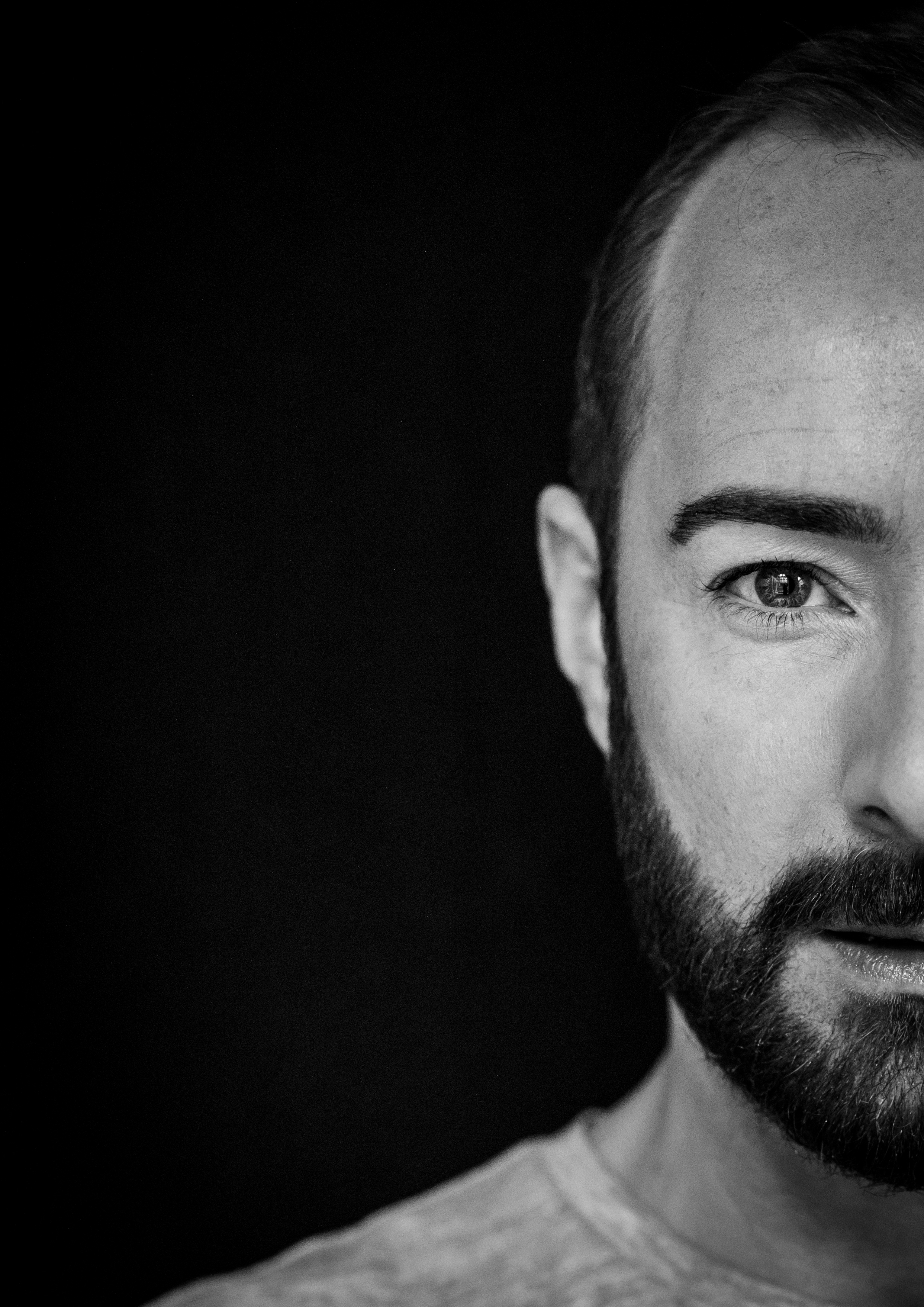
With the collection having never been seen in public before, Scott was keen to keep the collection under wraps – and so we were keen to showcase the cover as more of a profile on Scott himself. A direct headshot on the cover could quickly look quite catalogue though, so I opted to show only half of Scott’s face. Quite a striking look, but if done well could create really engaging eye contact for the reader, and something really different for an events brochure. The designer in me really loved only using half of the face too, as this left the perfect void space on the left-hand side of the cover, where I can add event highlights and titles.
The Photoshoot
The quality of the image was everything for this concept to work. There needed to be no distraction with the photo other than Scott's face, with particular focus on the emotion in Scott’s eyes.
I worked alongside our amazing Head of Photography Olivia Brabbs on this shoot, with Sonia Schofield supporting with Makeup. The shoot itself happed in Mansion House York, which was the venue for Scott’s show.
Olivia took a huge amount of photography. As well as capturing the perfect headshot for the cover, she managed to capture lifestyle photos that could be used in our article too.
The Design
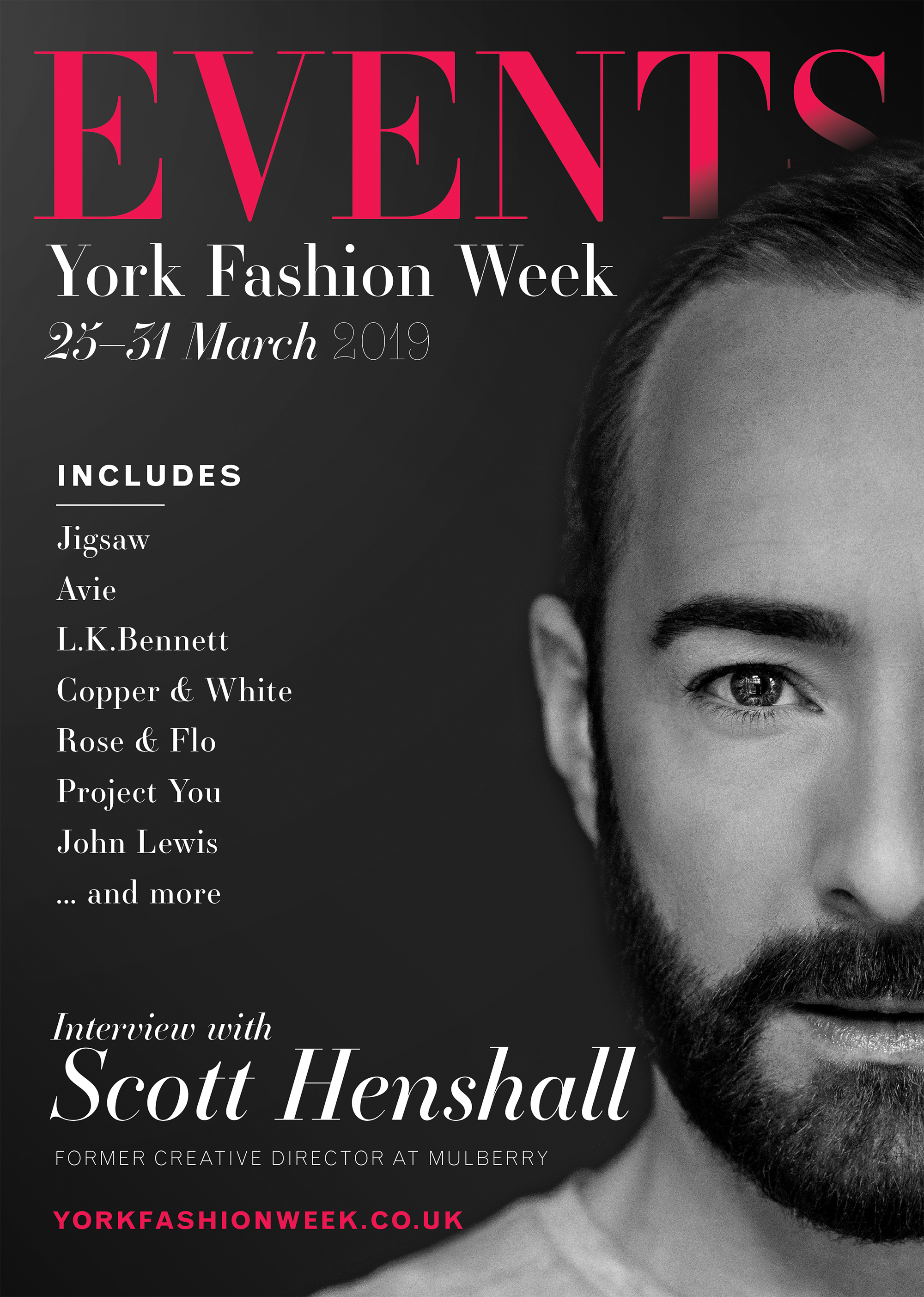
Now that we had the hi-res photography ready, and the events confirmed, we could then begin fleshing up the design of the cover. I knew I wanted a black and white image of Scott, so we could add colour through the text instead.
Fashion is so much about breaking rules and I really wanted to reflect this in our colours. The chosen colour was a vibrant pink against black. A colour combo which so often is seen as garish or even cheap. But I knew we had to avoid this, by using exactly the right colour tones.
To reflect the fashion magazine, I wanted to use the word EVENTS as our masthead. And instead of articles on the cover, we’d be using the titles of events.
The final design was the black and white image against an off-black background, which made it look almost 3D. The pops of colour added vibrancy and really transformed the design from a poster to a fashion cover. But I must also offer a special thank you to Katie Allen Design, who supported on final enhancements to Scott’s image.
The Response
The magazine debuted at a launch party at The Principal in front of an audience of over 150 people, where people enjoyed champagne and received a copy of the brochure whilst networking with other members of the fashion community.
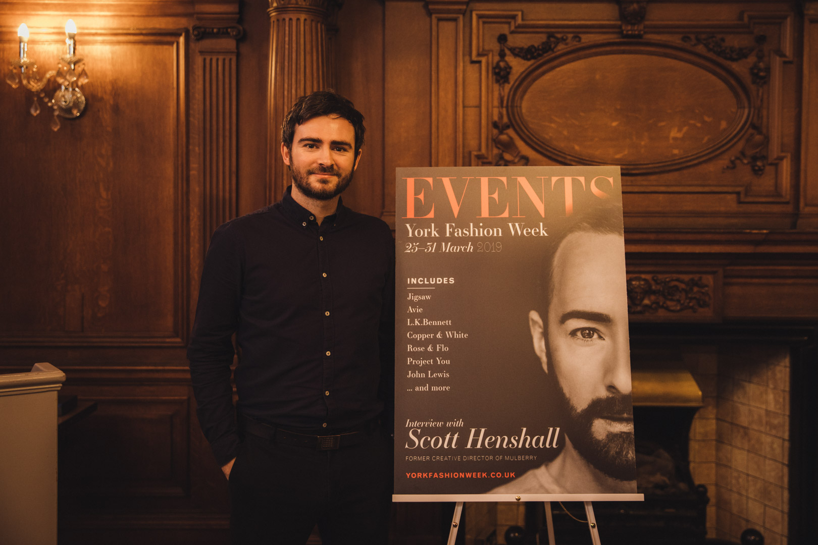
We had a number of A1 boards featuring the design of cover where people took selfies, grabbed group photos, and shared the design over social media.
The feedback was wonderful from both participants and advertisers alike. And we’re thrilled that plans for 2020 will include an even bigger events brochure, with even more in circulation.
written by Mark Bewick, Creative Director

